Ever want to combine multiple plots into a consistent file easily without having to open up Inkscape or GIMP?
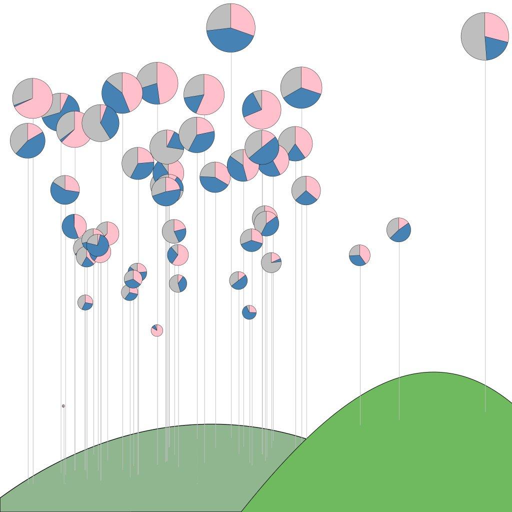
Perhaps you never thought you would need a garden of pie charts but rather:
- Revenue of multiple products over the fiscal year.
- Price (line) and volume (bar) of a stock over time.
- Income distribution (pie) per state (map).
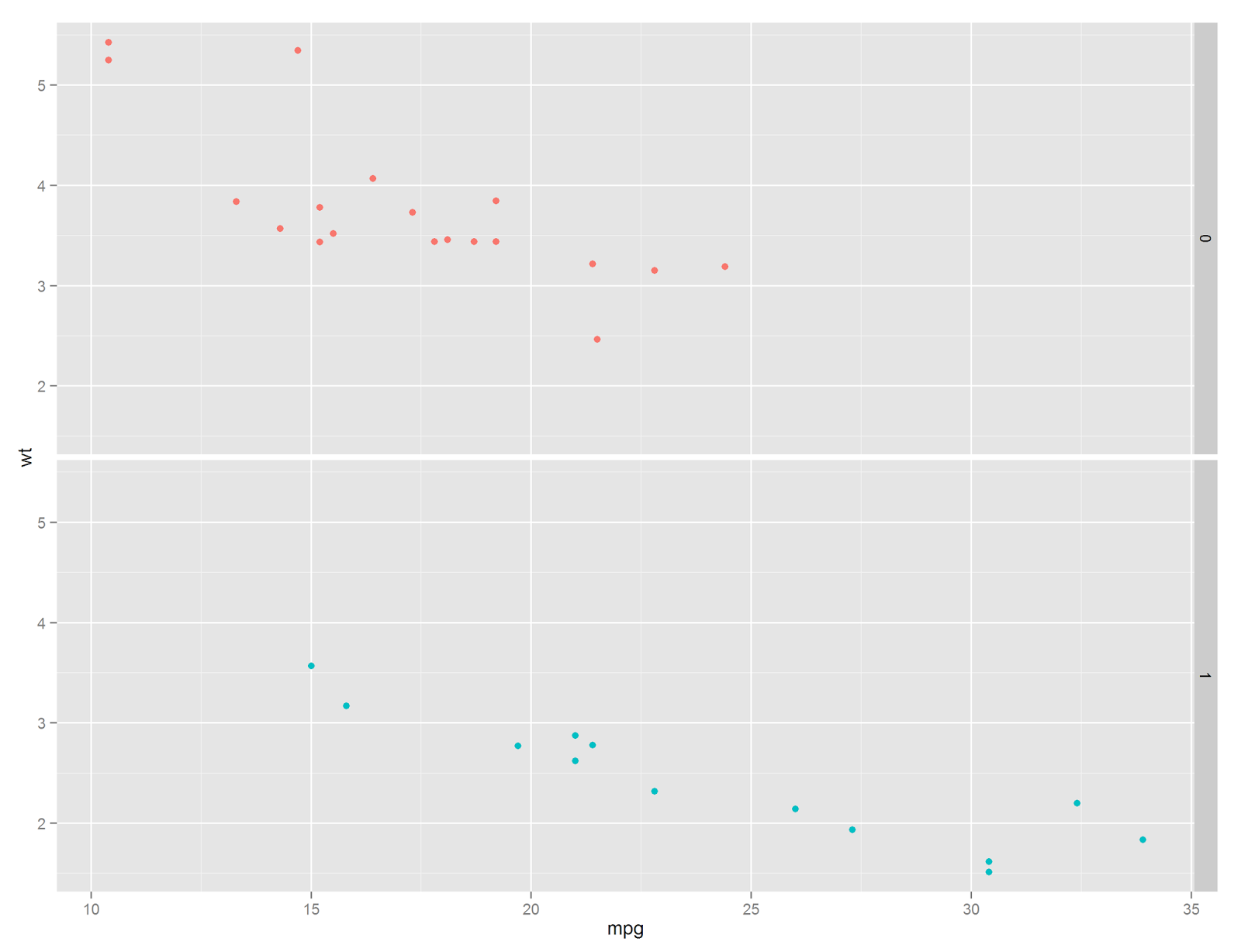
Stacking Similar Plots: Facets
qplot(data = mtcars,
      x = mpg,
      y = wt,
      color = factor(am))   +
  facet_grid(am ~ .)
Stacked Different Plots: gridExtra
To advance this into true subplots we need the help of an addition package: gridExtra. This package allows you to make separate plots and arrange them on a canvas.
a <- qplot(data = mtcars,
           x = mpg,
           y = wt,
           color = factor(am)) +
  theme(legend.position="none",
        axis.title.x = element_blank(),
        axis.text.x = element_blank(),
        axis.ticks.x = element_blank()) +
  xlim(c(10,35))

b <- qplot(data = mtcars,
           x = mpg,
           fill = factor(am),
           geom = "histogram",
           binwidth = 5) +
  xlim(c(10,35)) +
  theme(legend.position="none")

grid.arrange(a, b, heights = c(0.5, 0.250))
which yields a plot of MPG & weight (the two previous facets combined) and a histogram of the counts
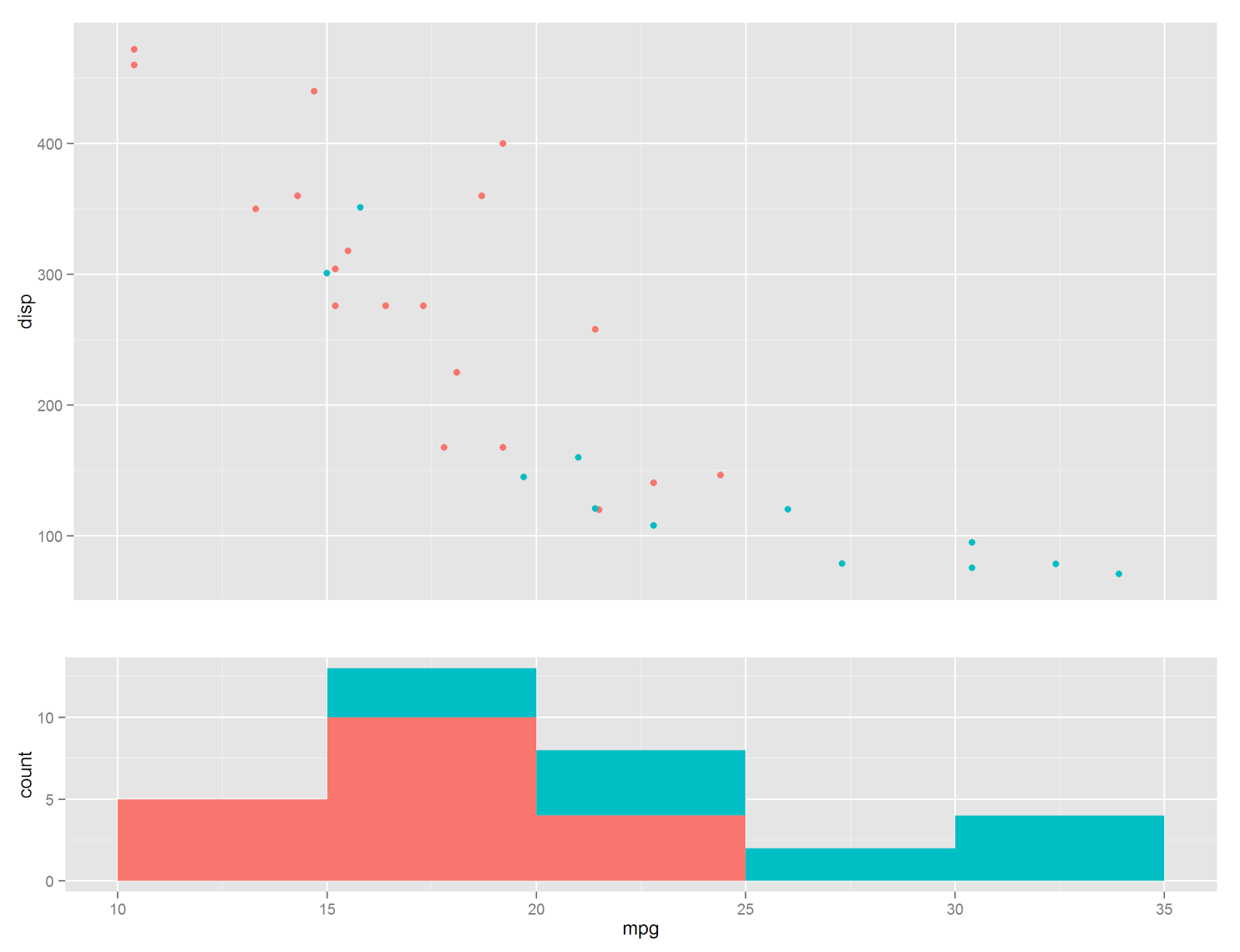
Wonderful, however it appears that I did some work that needs some explanation. Notice that lines 1-5 are simply creating a scatter plot, nothing new. Next we remove the color legend and the X axis (the title, text, and ticks). We do this primarily for aesthetics. Similarly we create a histogram in lines 11-15 and remove the legend on line 17. Finally we take these two plots and send it to grid.arrange. Notice we can set the height proportions via an array of values (which will automatically normalize itself, i.e. the upper plot is 66% of the canvas and the second is 33%, or 2:1).Simple, right? Well not quite. I purposely neglected to mention the manual setting of the limits of the two plots on lines 9 & 16. This typically needs to be done to get the two X-axes to line up. The issue with gridExtra is, well, it is a grid. The width of the two subplot areas are the same and when plots a and b are drawn ggplot takes up the whole width. When this happens they become askew.
This is the primary issue with gridExtra. If the subplots do not need to be aligned, you are good to go. If not, you may be able to shift them into place via the limits, however in some cases it may be hopeless. What would be needed is manually placing graphic objects on a canvas, not constrained to a grid, but anywhere. Don’t worry, I found a back-door solution and will be covered in Part 2.