At various times I have been asked to give insight in uncovering optimal locations for buildings. It is a very interesting optimization problems that I find myself coming back to every so often even though I am not formally trained or involved with marketing, real estate, or GIS. There are methods and even ArcGIS has a package for it, however when first introduced to the problem I started from scratch thinking more in terms of supply and demand.
From a person demanding a service, the optimal location for them would be right next door. I would love to have a Pizza-Hut, gas station, grocery store, and a Lowe’s right next to my house, wouldn’t you? Not particularly feasible and this definitely would over supply the system, so less locations need to be chosen. If the demand is uniformly distributed this is relatively simple; just combine neighboring sites until the supply equals the demand. This would yield coincidentally a uniform distribution of sites. Some will need to drive further now, but this is reasonable depending on the demand. I needed to drive a good bit for RC parts, but not to many people flew airplanes and helicopters (now with the influx of drones, the RC space has changed quite bit though).
The world unfortunately isn’t as simple: the demand or even the population is not uniform, the supply of each site may vary from one to another, sites are already exist with some even being competitors. Assuming we know what the distribution of demand across the region is (which can easily be the population by block from the Census) and some existing locations we can make some progress analytically. For a given site, suppose they supply a particular amount of service which decays away from the location. This would yield a map of mounds of hot spots over the region (specifically 2D gaussian distributions of catchment areas). Note that this is a bit different than say using Voronoi diagram (see my Nationwide Hospital Voronoi Tessellation example) which is better at finding complete catchment area. Rather these individual distributions help control for desire to travel for a service (which is tweaked by the parameters of the distribution) and how much they can supply or influence (adjusted by their amplitude).
So with the mounds of supply hot spots and the landscape of demand we simply can subtract the two. This leaves a new two dimensional distribution over the region where peaks are over supplied areas and valleys under supplied. Below is an example of such a map:
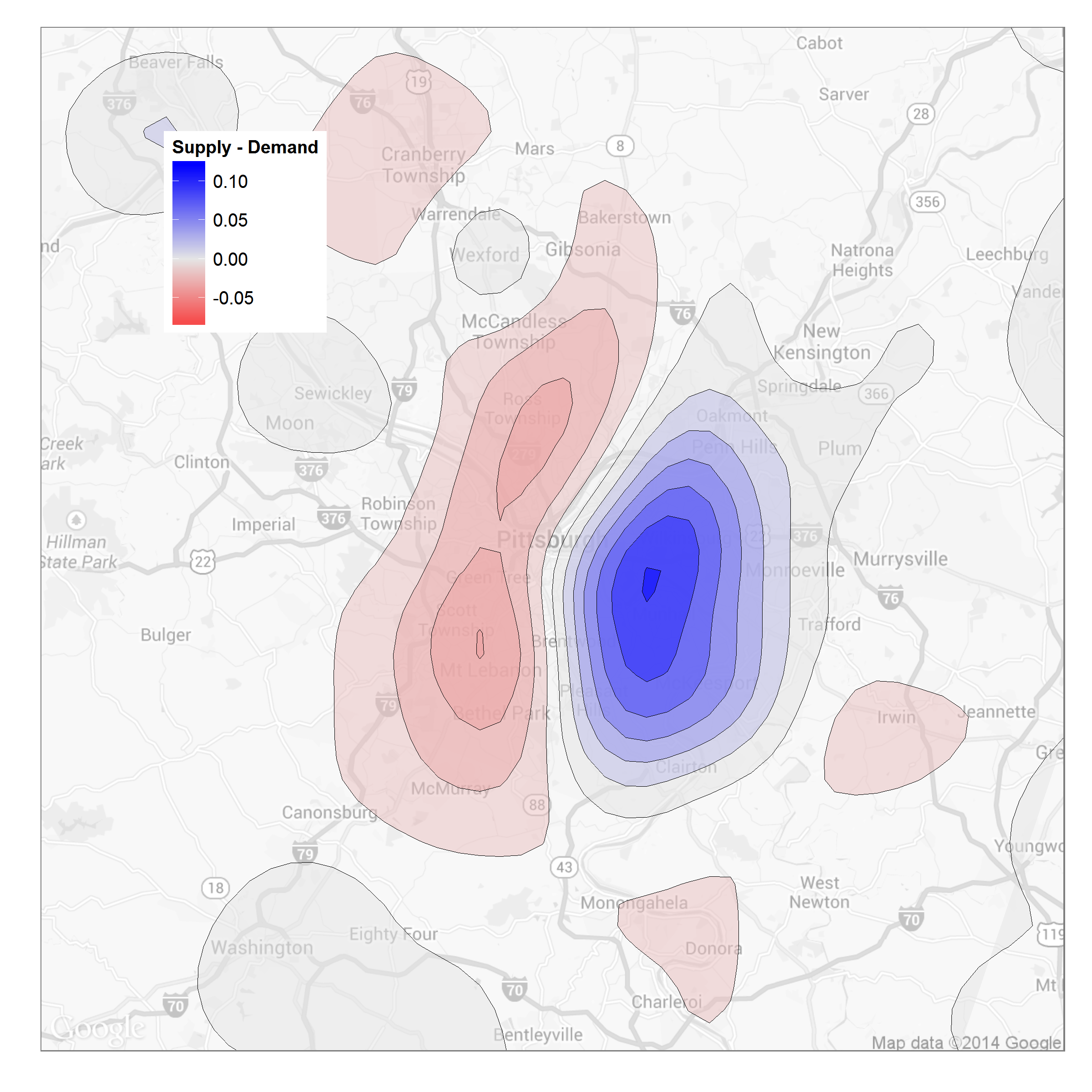
In the plot, the blue region is a high concentration of suppliers easily providing enough to meet local demand. On the other hand to the left are two regions what are under-supplied and ripe to have new locations. This framework easily allows for analysis of these new scenario: simply add prospect locations with their assumed supply to the existing supply map and subtract again. Additionally, overlay the Voronoi diagram to visualize the catchment borders. Unfortunately the optimization is still a manual process, however with a properly defined utility function this should easily be automated.
About the Plot
The above example was done in R. ggplot2 was used for the contour plot and ggmaps for location geocoding and map overlay. I will post some code snippets soon.